Pictograms for Vimento
Project overview
Vimento is a Danish company specializing in data-driven analytics and marketing optimization. Their product, SPARTA, uses AI and predictive data modelling to help businesses target the right customers, reduce unnecessary marketing spend, and increase ROI. In this collaborative group project, our team was responsible for visually communicating SPARTA’s core product values through a cohesive system of pictograms and supporting visual language, making complex data-driven concepts more accessible and understandable for potential clients.
My role
I was responsible for concept development and the design of a cohesive pictogram system. This included research, analysis, exploring visual concepts, refining the iconography to ensure consistency and clarity, and preparing the final assets for implementation across both web and print applications.
Methodology
Research & conception
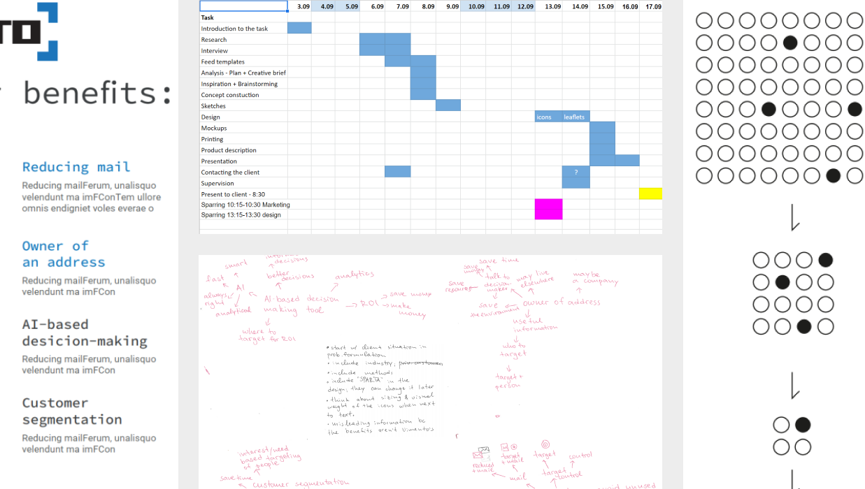
The project began with an in-depth analysis of Vimento's business, its SPARTA platform, and the communication challenges the company aimed to address. To better understand the product and its target audience, we conducted stakeholder interviews, reviewed the client's existing materials and design system, and analyzed competitors, industry trends, and visual symbolism within the telecommunications and data consulting sector. Brainstorming sessions, visual references, and hand-drawn sketches were used to explore different approaches to representing SPARTA's core values through a coherent icon system and supporting marketing materials. Multiple directions were evaluated before selecting the strongest concepts for further development into vector illustrations.
.png)
Design process & final outcome
The design process focused on creating simple, intuitive graphics capable of communicating SPARTA's key features while remaining consistent with Vimento's existing visual identity. Sketches were translated into vector illustrations and iteratively improved through feedback sessions with the client's marketing team, leading to refinements in icon clarity, stroke weight, and overall visual consistency.
The final solution delivered a flexible set of icons accompanied by supporting marketing materials that clearly communicate the value of SPARTA's data-driven services. By simplifying complex concepts into a clear visual language and presenting them within a structured brochure, the project provided Vimento with a professional communication package that could be used across both digital and printed touchpoints.

.png)

.png)